The ASEAN logo, with its vibrant colors and distinctive emblem, holds profound meaning and symbolism, reflecting the shared values, aspirations, and identity of the Association of Southeast Asian Nations. Each element of the logo, from the color palette to the symbolic forms, has been carefully chosen to represent the spirit of ASEAN and its vision for a united and prosperous Southeast Asia.
Deciphering the Colors of Unity
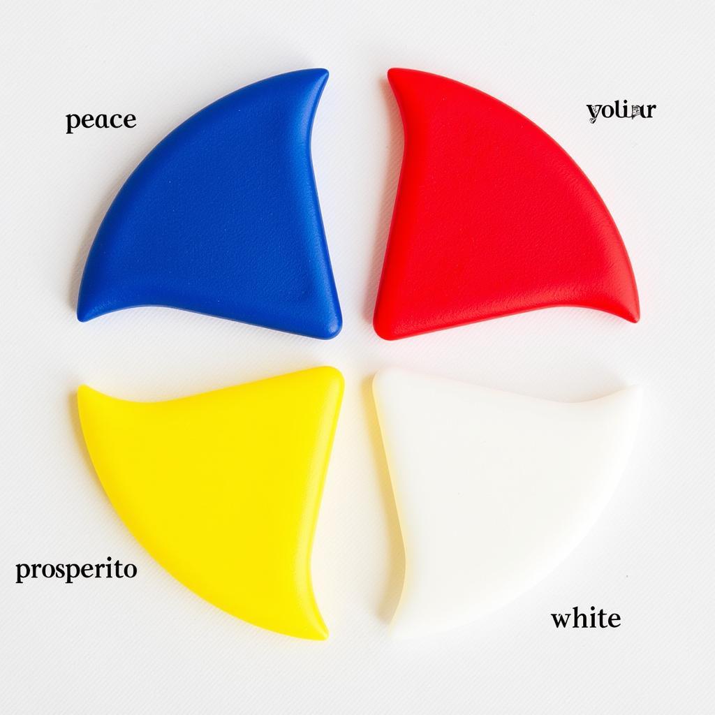
The primary colors of the ASEAN logo, blue, red, white, and yellow, are not arbitrary choices but carefully selected hues representing the national flags of all ten member states. This deliberate inclusion symbolizes unity and harmony within the diverse region.
- Blue signifies peace, stability, and prosperity, reflecting ASEAN’s commitment to regional security and economic growth.
- Red represents courage, dynamism, and the shared spirit of progress that drives the organization forward.
- White embodies purity, transparency, and ASEAN’s commitment to good governance and ethical practices.
- Yellow symbolizes hope, optimism, and the bright future that ASEAN strives to create for its people.
 ASEAN Logo Color Symbolism
The Ten Stalks of Rice: A Symbol of Prosperity and Unity
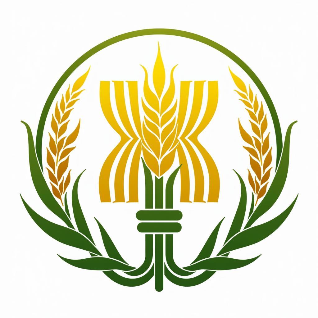
At the heart of the ASEAN logo lies a circle encompassing ten bound stalks of rice. This powerful symbol draws inspiration from rice, a staple crop and cultural cornerstone across Southeast Asia. The ten stalks represent the ten member states of ASEAN: Brunei Darussalam, Cambodia, Indonesia, Laos, Malaysia, Myanmar, the Philippines, Singapore, Thailand, and Vietnam.
The act of binding the rice stalks together embodies solidarity and the collective aspiration for a shared destiny. It conveys the message that by working together, ASEAN nations can overcome challenges and achieve greater prosperity for all.
The Circle of Unity and Completeness
Encompassing the rice stalks, the circle stands as a universal symbol of unity, wholeness, and harmony. In the context of the ASEAN logo, the circle reinforces the message of regional integration and the interconnectedness of Southeast Asian nations. It symbolizes the collective strength and resilience of ASEAN as a regional bloc.
 ASEAN Logo Circle and Rice Stalks
The ASEAN Logo: A Beacon of Hope and Aspiration
Beyond its individual elements, the ASEAN logo, as a whole, embodies the collective spirit and aspirations of Southeast Asia. It represents a region united by its shared history, culture, and values, striving towards a future of peace, stability, and shared prosperity.
Just as the colors and symbols of the ASEAN logo have been carefully chosen, so too have the actions and commitments of the organization been directed towards realizing the vision of a cohesive and prosperous Southeast Asian community. The logo serves as a constant reminder of the shared goals and values that bind the region together.
Conclusion
Understanding the Arti Dari Bentuk Bentuk Simbol Pada Logo Asean provides a deeper appreciation for the organization’s values and aspirations. The logo stands as a testament to the power of unity, cooperation, and shared purpose. As ASEAN continues to play a pivotal role in shaping the future of Southeast Asia, its logo remains a powerful symbol of regional identity, resilience, and the enduring spirit of Southeast Asia.

